
How Dial Color and Design Affect a Watch's Style
A watch dial is one of the first things you notice, and its color can change how the entire watch looks. Black, white, blue, green, brown, and other shades can read as formal, casual, sporty, or distinctive depending on the surrounding details. Markers, hands, layout, case, and strap also influence the result. This guide explains how to choose color, compare dark and light dials, pair a dial with its case and strap, and judge color online.
Why Dial Color and Design Set the Tone
Yes, dial color can affect how formal a watch looks, but color works together with markers, hands, finish, and layout. The dial color provides the base impression; its finish can change how that color behaves in different light. Markers and hands determine contrast and can make the same color feel refined or sporty. A three-hand layout generally looks quieter than a dial with several sub-dials. See the main watch dial types guide for more. It explains how dial construction varies across common watch styles and helps separate type from appearance when comparing products.
Common Dial Colors and the Look Each Creates
Black Dial Watches
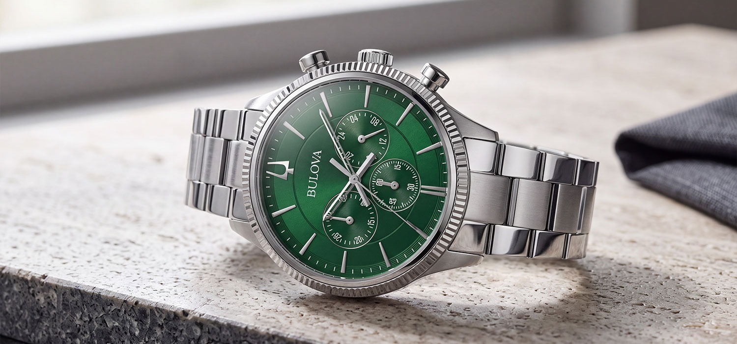
A black dial reads as versatile and formal by convention, especially with white or silver markers. Strong contrast can make it highly legible, while bold hands and lume can shift the same black dial toward a sportier look. Black also tends to make the dust on the crystal less noticeable. Pair a black dial with a steel bracelet for a classic effect or use a sportier case and strap for a more active look. Browse men's dress or sport watches.
White and Silver Dial Watches
A white or silver dial reads as clean and minimal, particularly with a simple layout. High contrast helps legibility, but silver markers on a white dial can reduce contrast. These shades are common across women's ranges, including ceramic and mother-of-pearl styles. A white dial can look crisp with steel and softer with a gold tone or leather. Browse women's dress watches or Michele watches.
Blue Dial Watches
A blue dial reads as classic with a little more visual interest than black, white, or silver. Navy is generally treated as closer to formal, while brighter or sunburst blue feels more relaxed. Blue can change noticeably between daylight, indoor light, and product photography, especially with a sunburst finish. Most style guides describe blue as the most popular contemporary watch color. See men's casual watches.
Green Dial Watches
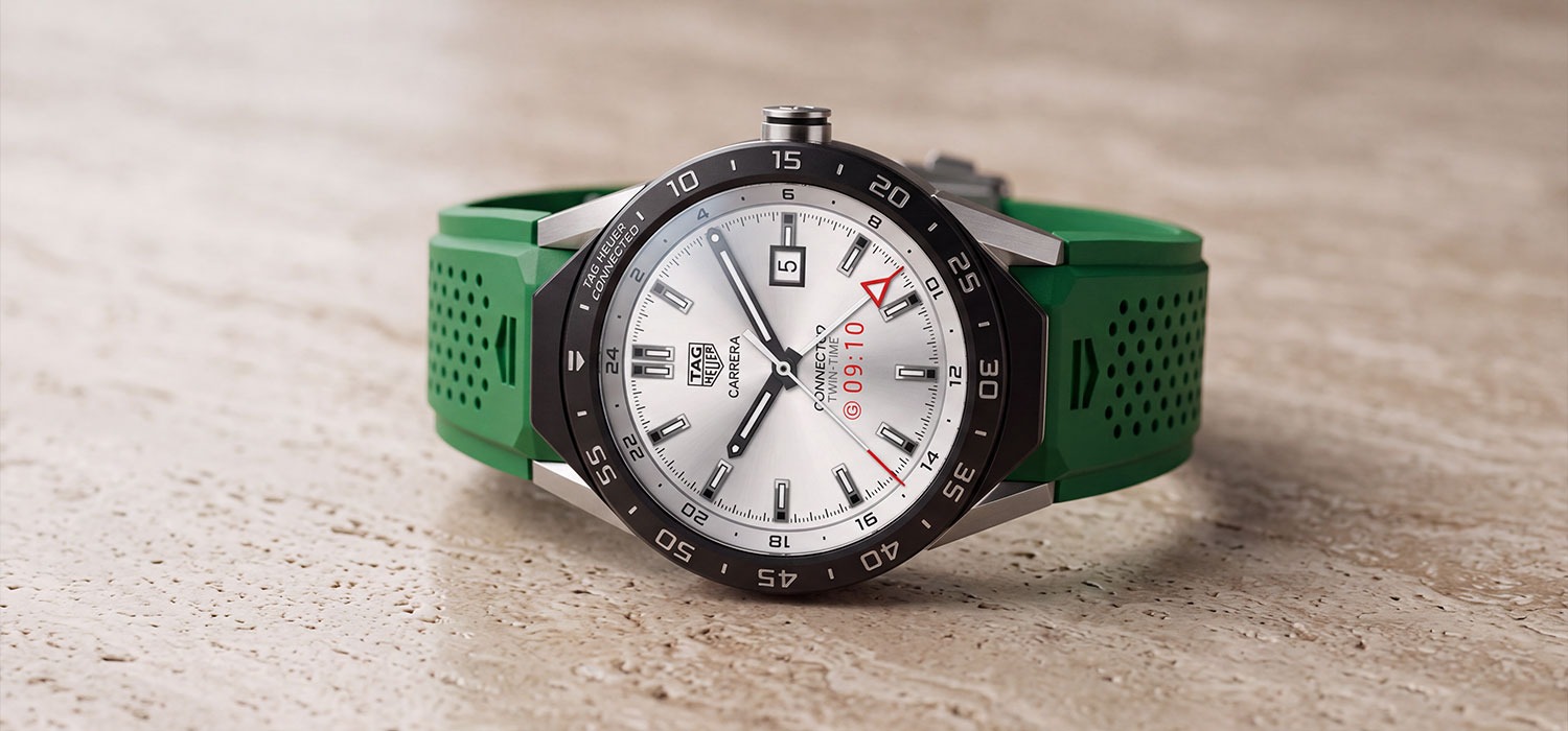
A green dial reads as a statement choice, with forest and darker greens generally appearing quieter than brighter emerald shades. Green can work especially well with brown leather when you want a warmer, more relaxed combination. Because saturated colors can shift under different lighting conditions, check more than one product image before buying. Browse men's or women's casual watches.
Brown, Champagne, and Salmon Dials
Brown, champagn,e and salmon dials read as warm and can create a vintage-inspired appearance. They often coordinate naturally with leather straps and gold-tone or rose gold-tone cases. Champagne can also work with steel when you want a softer alternative to white or silver. Compare the dial, case,e and strap together.
Mother of Pearl and Bold Fashion Colors
Mother-of-pearl and brighter fashion colors read as more decorative or jewelry-like, particularly when the dial shifts with the angle of the light. Mother-of-pearl can show white, pink, or other subtle tones rather than a single fixed color. Bold colors are easier to assess when you view several photos under different lighting conditions. Browse women's watches.
Dark vs Light Dials: Which Should You Choose?
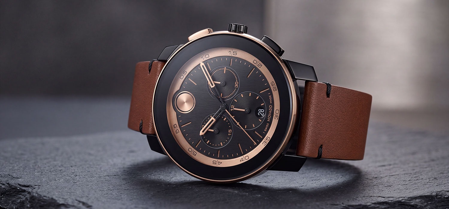
Black or white dial? Choose black for maximum versatility and strong contrast; choose white for a lighter, cleaner appearance. Legibility depends on the contrast between the dial and its markers in either case. Dark dials can appear smaller on the wrist, while light dials can appear larger at the same size. Photography also affects perception.
How Design Changes the Way a Color Reads
Can the same dial color look formal on one watch and sporty on another? Yes. Slim applied batons and restrained hands generally read dressier, while large Arabic numerals, bold hands, and luminous details generally read sportier. A plain three-hand dial can therefore look more formal than a chronograph in the same color. Sub-dials add visual activity, while a date window adds information without necessarily making the design busy. A minimalist black Movado Museum-style dial, and a black Bulova chronograph show how layout changes one color. Finish also matters: sunburst shifts with light, while matte stays steadier. See the finished guide for more details. The surface treatment can change reflections, perceived depth, and the way a color appears from different angles, so it is worth considering alongside the base shade.
Matching Dial Color With Case, Bracelet, and Strap
Gold or silver? Start with the metals you already wear, then consider whether you want the dial to reinforce or contrast with that case finish. Steel is the most neutral case option, while gold tone and rose gold tone create a warmer frame. Leather can soften or warm the appearance of almost any dial, while a bracelet usually keeps the look more structured.
|
Dial |
Stainless steel |
Gold/rose gold tone |
Two-tone |
Leather |
|
Black |
Classic |
Refined |
Classic |
Warm contrast |
|
White/silver |
Clean |
Soft |
Classic |
Versatile |
|
Blue |
Sporty/classic |
Rich |
Polished |
Relaxed |
|
Green |
Modern |
Warm |
Distinctive |
Natural |
|
Brown/champagne |
Warm |
Cohesive |
Vintage |
Warm |
|
Mother of pearl |
Clean |
Jewelry-like |
Polished |
Soft |
A warm dial, such as champagne or brown, naturally complements a gold-tone case, while white, silver, and blue sit comfortably with a steel case. Mother-of-pearl can work particularly well with a rose gold tone. Two-tone bracelets offer a middle ground between steel and gold. See the watch materials guide for facts on steel, PVD, and gold-tone. Gold-tone Citizen and Coach bracelet watches illustrate the effect.
Choosing a Dial for Occasions, Wardrobe, and Everyday Wear
Work and Formal
Which dial color suits formal occasions? Black, white, silver, and navy are the conventional choices, especially on a relatively simple dial with slim markers. A restrained case can reinforce that effect. Browse men's or women's dress watches for a more formal starting point. See the dress, sport, and casual guides for broader style choices.
Everyday and Casual
Blue, green, and brown can work well for everyday wear when you want more color without making the watch overly decorative. A date display or chronograph can add visual detail. Pair these choices with men's or women's casual watches to compare how case and strap combinations affect the result.
Sport
For sport, prioritize readability: high contrast between the dial, hands, and markers matters more than choosing a particular color. Lume, bold hands, and a secure strap can reinforce the practical character. Browse men's sport watches or women's sport watches for activity-focused designs.
Your Wardrobe
How do you choose a dial color for your wardrobe? As a styling convention, neutral wardrobes can carry a colored dial, while bold or patterned wardrobes often work more easily with a neutral dial. Match the case metal to the jewelry you already wear.
Versatile or Statement?
What is the most versatile watch dial color? By convention, black is the safest starting point, followed by white or navy, because these shades pair with many metals, straps, and outfits. A statement color makes sense for a second watch, a casual wardrobe, or a stronger preference. Neutral colors and simple layouts suit more occasions; fashion colors feel more specific.
What to Check When Buying a Watch Online
Before buying a watch online, use the product description as well as the photos:
- Brand color names are not standardized, so “champagne,” “silver-white,” and similar terms can describe different appearances.
- Check more than one image or lighting condition. Sunburst and saturated colors can look darker, brighter, or more reflective than they appear in a studio photograph.
- Look at the marker and hand color to judge contrast, not just the dial.
- For pre-owned watches, check for even color, fading, moisture marks, or other visible signs of wear.
- If uncertain, the more neutral dial is usually simpler.
For additional checks when buying online, see the guide to checking a watch from photos before buying, and browse pre-owned watches. Compare the same watch under natural and indoor light before deciding on color.
FAQ
1. Is a black or a blue dial more versatile?
Black is the conventional all-purpose choice; navy offers similar versatility with more visual interest.
2. Do white dials look bigger?
Light dials generally appear larger than dark dials of the same size.
3. Should the dial color match the strap?
It does not need to match exactly; it should coordinate. Warm dials pair well with brown leather or gold-tone, while cooler dials often work with black leather or steel.
Wrapping up
Choosing a dial starts with color, but the decision should not stop there. Consider the design, contrast, case finish, bracelet or strap, wardrobe, and occasions where you will wear the watch. A neutral dial simplifies an everyday collection; a stronger color adds variety. Compare men's and women's watches by style, including pre-owned or clearance selections. For broader buying advice, continue to the watch buying guide.
Newest Guide & Blog Updates

Sunburst, Matte, and Textured Watch Dials Explained
A watch dial is one of the first details that captures attention. Beyond displaying the time, the d...
How Dial Color and Design Affect a Watch's Style
A watch dial is one of the first things you notice, and its color can change how the entire watch l...

Watch Dial Types Explained: What Should You Know Before Buying?
Every time you look at a watch, the dial is the first detail you notice. Often called the watch fac...

Is Rado a Good Watch Brand? What Sets It Apart From Other Swiss Names
When people begin searching for a Swiss watch, they often compare brands based on heritage, craftsm...

How to Buy Watches Wholesale: A Step-by-Step Guide for Resellers and Retailers
Buying watches wholesale may appear straightforward. Find a supplier, purchase inventory at a lower...

Movado Bold vs. Museum Classic vs. Series 800: Which Collection Actually Fits You?
Choosing a Movado watch can become surprisingly complicated once you compare collections side by si...